


Final Design
Contents
Discovery: An airline website hard to navigate
01
Define: Main customers’ problems
02
Develop: From an unclear design to an intuitive one
03
Deliver: Users where concern about the meal selection
04
Reflect: ANA’s Design vs New Design
05

Overview
All Nippon Airways is a a Japanese airline, being the 3rd Best Airline in the World in 2023, according to Skytrax. The airline is using it's website as the main tool to sell tickets.
ANA's brand identity revolved around exceptional service, fostering innovation, promoting sustainability and contributing positively to the aviation and society as a whole. Their mission is to be a leading global airline that not only connects people and places but also make a positive impact on the world.
Role
As a UX/UI Designer I wanted to understand the booking flow of a ticket and the struggles users had when they were going through this process. I discovered the ANA Airways website and I noticed that it had a poor UX/UI Design, so I decided to challenge myself and to re-design it.
Methodology
For this project I decided to use Double Diamond Framework to guide me through the process. To collect data I choose to use Solution Space Research and Observation to understand how users were navigating through website and how they were booking a flight ticket.
Time
June 2023
Challenges
1
To reduce ANA’s website cognitive load
2
To architect a shorter and intuitive Booking Flow
3
To improve UI Design
Business Goals
1
Increase conversation rate
Increase the conversation rate by reducing the cognitive load, makeing the website consistent and easy to use.
2
Increasing the revenue from ticket selling
Increasing the revenue from ticket selling by architecting a new Booking Flow.
Discovery: An airline website hard to navigate
A better understanding of the airline industry
Doing a desk research, I found the following, according with Worldpay’s recent study:
90%
of flights were booked on desktop
5%
of flights are reserved on mobile
21%
of travellers abandoned their booking because the checkout process took long
20%
of travellers abandoned their booking because they had to enter too much information
My assumption that ANA’s website was cognitively overloading the users was validated
Assumption:
Website was cognitively overloading the users.
Research Method:
Solution Space Research --> Observation
User Tasks:
• to navigate through website in order to find information about destinations, classes, baggage allowance;
• to book a flight ticket from Step 1 "Searching Flight" until last step "Payment"
Research Focus:
To collect feedback from the users and timing the process.
Target Audience:
Travellers who have booked a flight ticket minimum 2 times.
People Interviewed:
5
Research Insides:
• 8 Steps: Booking Flow
• 14 mins average time to complete ANA’s Booking Flow
• 3 from 5 users wanted to quit on step 6 “Seat Request”
• Information is not well organised
• Design is not consistent
“I don’t know where to focus ” - said one of the participants
Define: Main Customers’ Problem
1
Users had to shift between pages
Users experienced the need to navigate back and forth between pages in search of the information sought. This issue is particularly noticeable on the Home Page and during the Booking Flow.
2
Users had to go through a long check out
ANA’s booking flow is long, consisting of 8 steps that requires users to navigate between ages to complete. The information presented on these steps lacks delimitation, making it challenging for users to maintain focus.
3
Users got confused because of lack of consistency
The existing design lacks visual appeal and does not maintain a consistent style, resulting in confusion for users.
Customer Journey Map
I used a Customer Journey Map to identify the good, bad or missing interaction between travellers and ANA’s Booking Flow.
Arranging data found during the research, using a Customer Journey Map, helped me identify the most challenging steps for the users:
• Select Flight 2
• Seat Request

Scoping
Based on the research insights, complexity of the website and a big amount of information, I decided to redesign the website for desktop, focusing on:
• Booking Flow
• Booking Card
• Home Page
Develop: From an unclear design to an intuitive design
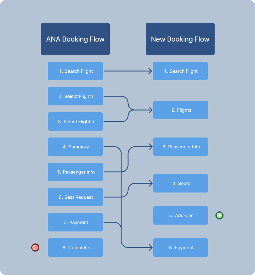
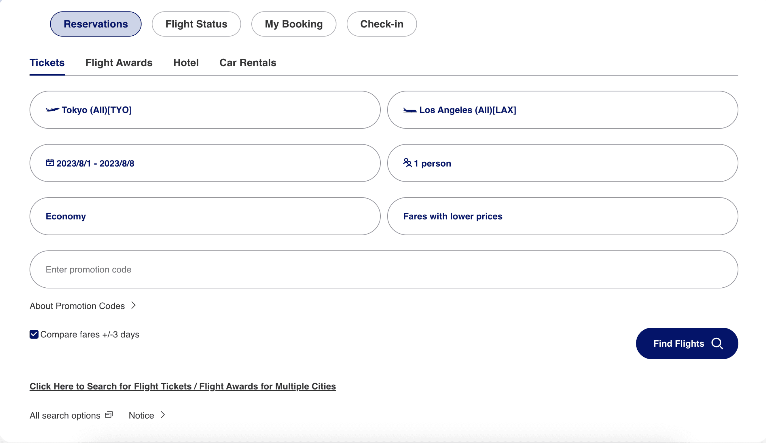
Architecting a shorter and intuitive Booking Flow
To re-design the Booking Flow I used the same Information Architecture as ANA, Sequential.
Problem: ANA’s booking flow is too long
ANA’s Booking Flow has 8 steps, having approximately 13 web pages.
Solution: shorter and intuitive booking flow
The new booking flow that I am proposing has 6 steps and each step requires one page.
Modifications:
Reasons:
ANA’s Booking Flow Step 2 “Select Flight 1” and Step 3 “Select Flight 2” were compiled into one step: New Booking Flow Step 2 “Select Flights”.
The users now have all the needed information structured in one page.
ANA’s Booking Flow Step 4 “Summary” was moved to New Booking Flow Step 6 “Payment”.
I moved the “Summary” in the “Payment” sections before introducing the payment details. It is easier for the users to have a summary visible exactly before doing the payment and gives them flexibility.
ANA’s Booking Flow Step 8 “Complete” was removed.
I am assuming here is a page with the ticket and confirmation. I can not know exactly because I did not pay for the tickets. This is not a step, it is a confirmation of booking the ticket.
Added New Booking Flow Step 5 “Add-ons”.
I added it mostly from the point of the business. The airline can sell here lounge access and extra baggages allowance.
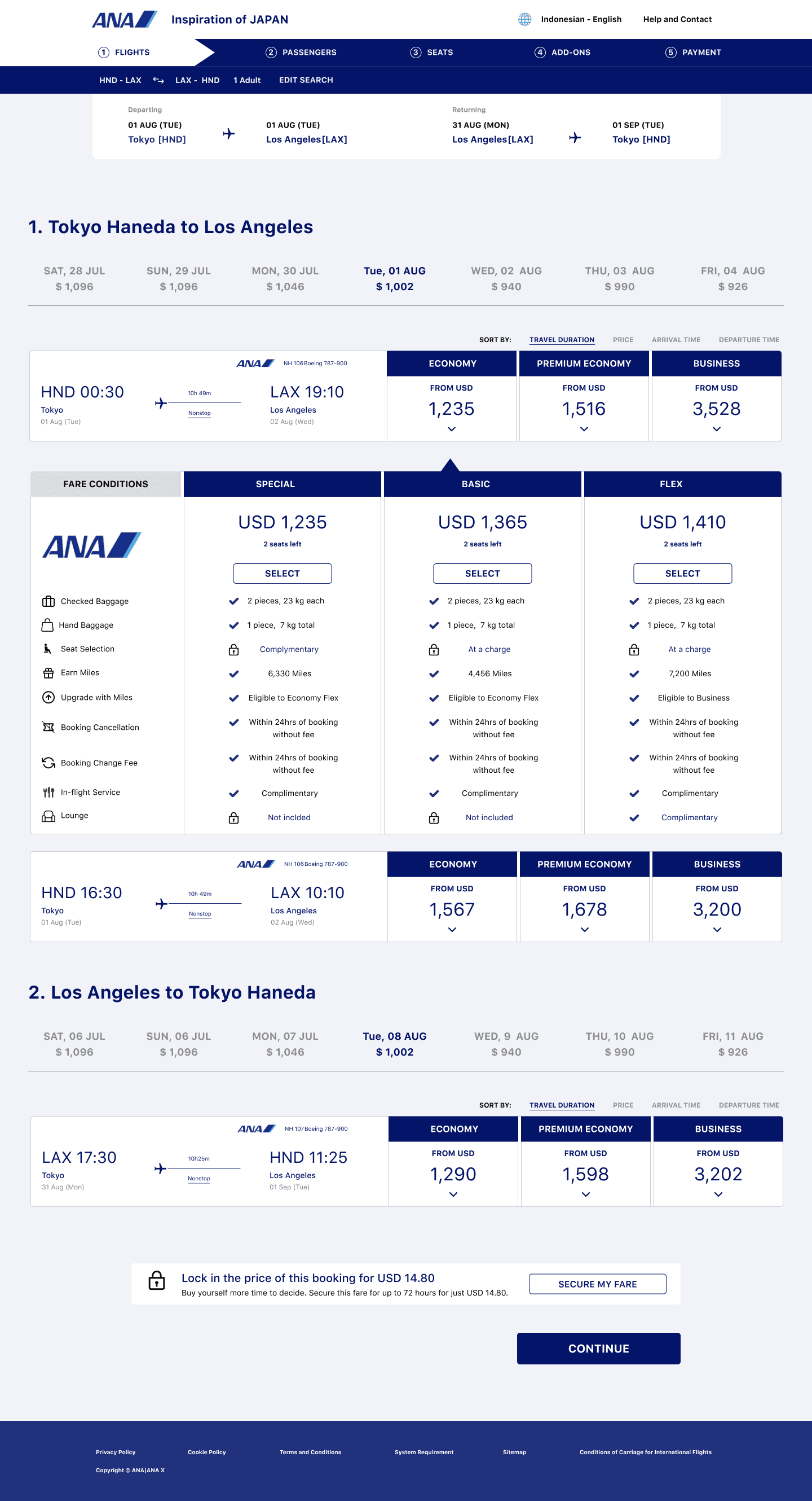
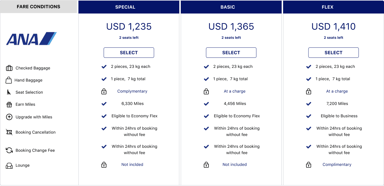
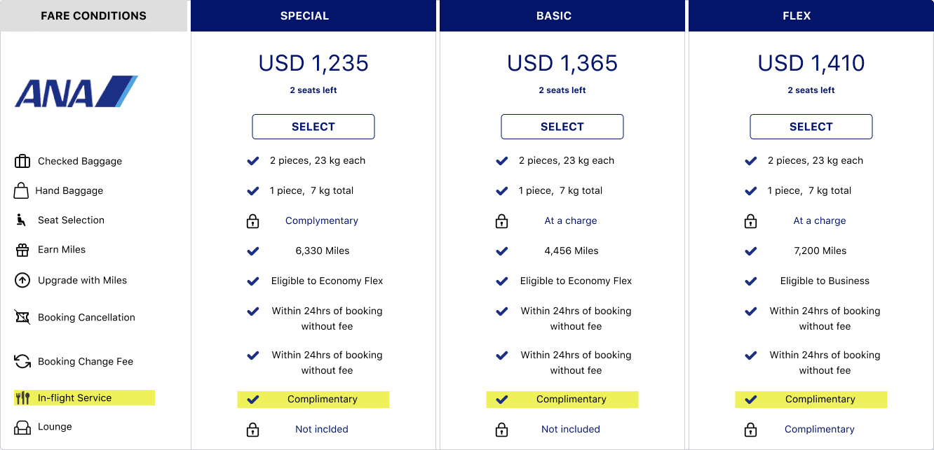
Booking Flows
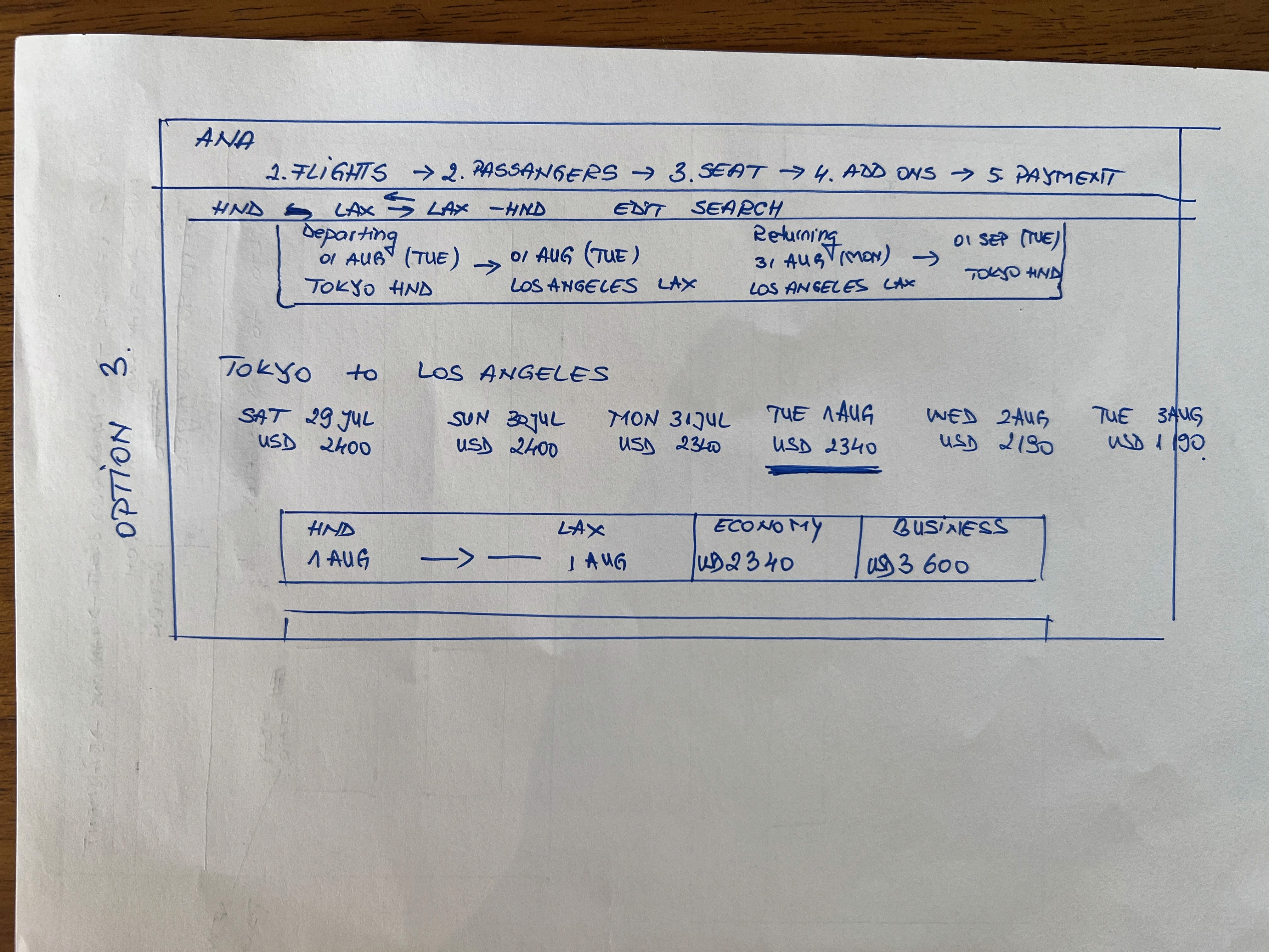
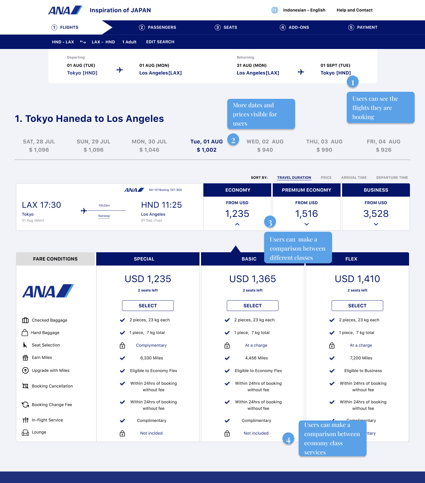
Step 2 “Flights” was the most challenging to design
To design this step I asked myself the following questions:
• How can I make visible the flights that users are booking ?
• How can I display different dates and prices without using filter or searching?
• How many Classes should be displayed ?
• How can I arrange the information about each Class services in a easy and clear way ?
I designed the following paper wireframes and I compare them. I choose the Option 3 wireframe and I created it in Figma.
Wireframes

Step 2. Flights - Design
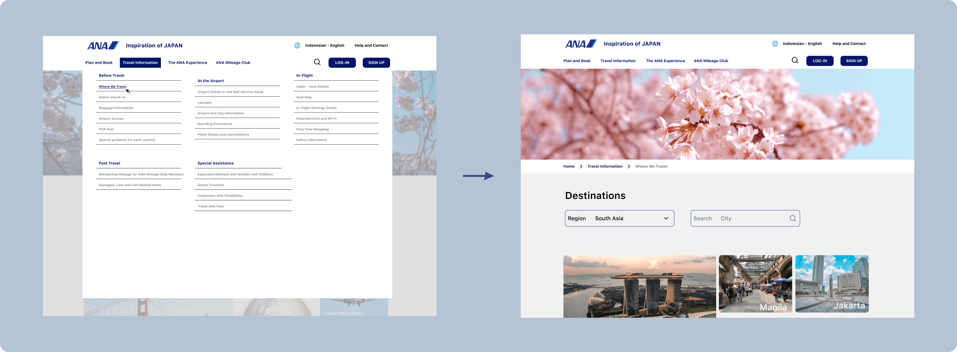
Home Page: no more shifting between pages
For the webpage list I used the same Information Architecture as ANA, Hierarchical.
Problem: too many clicks to navigate
Upon selecting “Plan and Book”, “Travel Information”, “The ANA Experience”, or “ANA Mileage Club”, a fresh web page opens each instance.
Solution: Lists
The solution that I am proposing is offering an overview of the web page using List which opens while hovering on the section area of the Navigation Bar.
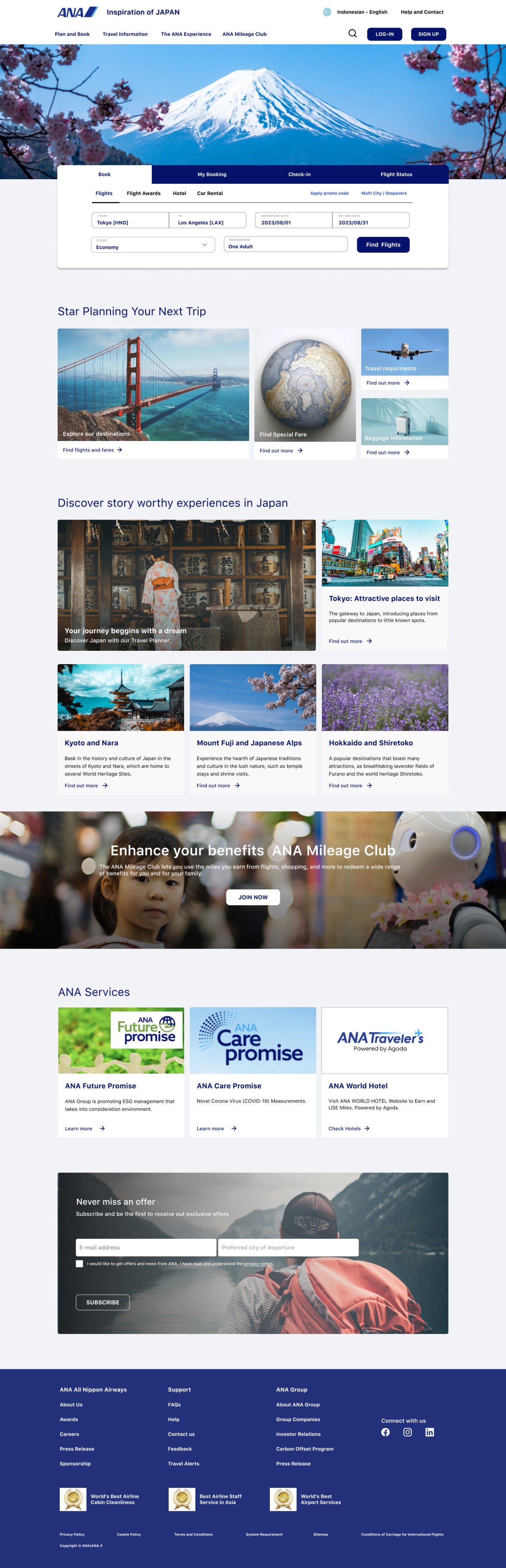
ANA Home Page
New Home Page
An organised and appealing Booking Card
Problem: copyright, inconsistancy
On booking card there are mistakes such as copyright, missing icons and inconsistency, buttons placed where are not supposed to be.
Solution: correcting mistakes
I redesigned the Booking Card, making it looks like a boarding pass and correcting the mistakes.
ANA Booking Card
New Booking Card
Deliver: Users were confused about the meal selection
I showed the prototype to 5 users.
I was particularly interested in the Booking Flow and how intuitive was. I also timed the users to see how much time it takes to go through the flow, from booking a flight until payment.
I wanted to compere with ANA’s booking flow timing to see if there is any improvement.
1
Booking Flow Completion 10 mins average time
Completing the New Booking Flow it takes 10 mins on average, which is a good improvement compering with completion of ANA’s Booking Flow which is 14 mins on average.
2
Users were concerned about meal selection
Two users asked why there was no information about the food received on board.
3
Step 4. Add-Ons was suggested to be removed
Another user suggested to remove the ADD-ons because she was not interested in.
Usability Tests Insights
“I like the design. It is easy to navigate through the booking flow” - said one of the participants
Iteration Decisions
1
Introduced "meal selection" into design
I added information about the food in the Flight Details Card and in the Summary.
2
Kept the step Add-ons
I kept the Step Add-ons because I put my business hat on and I considered this step might bring extra profit for the airline.
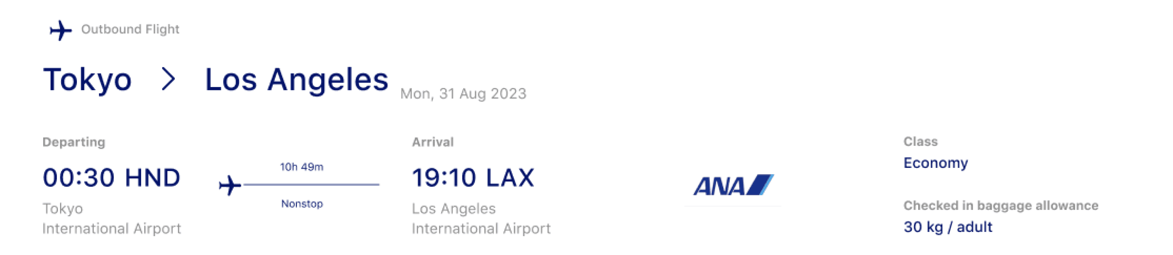
Iteration Flight Detail
Iteration Summary

From this usability test I learned that I need to take into consideration also the business need, that’s the reason that I did’t not remove the step 4 “ADD-ONS”.
Elements
Redesign the UI, I took into consideration the colours that ANA’s website is currently having and also the companies’s values.
I chose to use cards throughout the design process to offer a better overview of the information and to make the website appealing.
I changed the shape of the button modifying the corners to 5 radius. I wanted to give a more professional look, but in the same time to be easy for the eyes. The ANA Design buttons with the round corner were friendly, but were not looking professional and classic.
#000000
#041469
#FFFFFF
#ECC3D3
#C1D8F3
#F2F3F9


Colour pallet
Buttons
Cards

Reflect: New Design vs
ANA Design
New Design
6 Steps
Booking Flow
10 mins
Average time to complete ANA’s Booking FLow
ℹ
Information is pleasantly structured
✎
Consistency throughout the entire design.
ANA’s Design
8 Steps
ANA’s Booking Flow
14 mins
Average time to complete ANA’s Booking FLow
ℹ
Information is not well organised
✎
Design is not cosistent
Reflecting on the hole process, I consider the most important piece in redesigning ANA’s website was the Information Architecture. I decided to focus on the Information Architecture after doing Desk Research and Solution Space Research --> Observation .
The research validated my assumption that the ANA’s booking flow and website were cognitively overloading the users.
One stage that I found useful during the process was the paper wire-framing, where i was able to organise the information with sketches.
I would like in the future to have the chance to re-design the entire website, adapting it for tablets and mobile phones.
What I would measure
• The conversion rate;
• The airline tickets sales through the website;
• Additional seals coming from seat selection and add-ons;
• The rate of users who are abandoning the Booking Flow and where.
Reflecting on the hole process, I consider the most important piece in redesigning ANA’s website was the Information Architecture. I decided to focus on the Information Architecture after doing Desk Research and Solution Space Research --> Observation .
The research validated my assumption that the ANA’s booking flow and website were cognitively overloading the users.
One stage that I found useful during the process was the paper wire-framing, where i was able to organise the information with sketches.
I would like in the future to have the chance to re-design the entire website, adapting it for tablets and mobile phones.
Final Design
Contents
Discovery: An airline website hard to navigate
01
Define: Main customers’ problems
02
Develop: From an unclear design to an intuitive one
03
Deliver: Users where concern about the meal selection
04
Reflect: ANA’s Design vs New Design
05
Overview
All Nippon Airways is a a Japanese airline, being the 3rd Best Airline in the World in 2023, according to Skytrax. The airline is using it's website as the main tool to sell tickets.
Role
This is a personal project. As a UX/UI Designer I wanted to understand the booking flow of a ticket and the struggles users had when they were going through this process. I discovered the ANA Airways website and I noticed that it had a poor UX/UI Design, so I decided to challenge myself and to re-design it.
Methodology
For this project I decided to use Double Diamond Framework to guide me through the process. To collect data I choose to use Solution Space Research and Observation to understand how users were navigating through website and how they were booking a flight ticket.
Time
June 2023
Challenges
1
To reduce ANA’s website cognitive load
2
To architect a shorter and intuitive Booking Flow
3
To improve UI Design
Business Goals
1
Increase conversation rate
Increase the conversation rate by reducing the cognitive load, making the website consistent and easy to use.
2
Increasing the revenue from ticket selling
Increasing the revenue from ticket selling by architecting a new Booking Flow.
Discovery: An airline website hard to navigate
A better understanding of the airline industry
Doing a desk research, I found the following, according with Worldpay’s recent study:
90%
of flights were booked on desktop
5%
of flights are reserved on mobile
21%
of travellers abandoned their booking because the checkout process took long
20%
of travellers abandoned their booking because they had to enter too much information
My assumption that ANA’s website was cognitively overloading the users was validated
Assumption:
Website was cognitively overloading the users.
Research Method:
Solution Space Research --> Observation
User Tasks:
• to navigate through website in order to find information about destinations, classes, baggage allowance;
• to book a flight ticket from Step 1 "Searching Flight" until last step "Payment"
Research Focus:
To collect feedback from the users and timing the process.
Target Audience:
Travellers who have booked a flight ticket minimum 2 times.
People Interviewed:
5
Research Insides:
• 8 Steps: Booking Flow
• 14 mins average time to complete ANA’s Booking Flow
• 3 from 5 users wanted to quit on step 6 “Seat Request”
• Information is not well organised
• Design is not consistent
“I don’t know where to focus ” - said one of the participants
Define: Main Customers’ Problem
1
Users had to shift between pages
Users experienced the need to navigate back and forth between pages in search of the information sought. This issue is particularly noticeable on the Home Page and during the Booking Flow.
2
Users had to go through a long check out
ANA’s booking flow is long, consisting of 8 steps that requires users to navigate between ages to complete. The information presented on these steps lacks delimitation, making it challenging for users to maintain focus.
3
Users got confused because
of lack of consistency
The existing design lacks visual appeal and does not maintain a consistent style, resulting in confusion for users.
Customer Journey Map
I used a Customer Journey Map to identify the good, bad or missing interaction between travellers and ANA’s Booking Flow.
Arranging data found during the research, using a Customer Journey Map, helped me identify the most challenging steps for the users:
• Select Flight 2
• Seat Request
Scoping
Based on the research insights, complexity of the website and a big amount of information, I decided to redesign the website for desktop, focusing on:
• Booking Flow
• Booking Card
• Home Page
Develop: From an unclear design to an intuitive design
Architecting a shorter and intuitive Booking Flow
To re-design the Booking Flow I used the same Information Architecture as ANA, Sequential.
Problem: ANA’s booking flow is too long
ANA’s Booking Flow has 8 steps, having approximately 13 web pages.
Solution: shorter and intuitive booking flow
The new booking flow that I am proposing has 6 steps and each step requires one page.
Modifications:
Reasons:
ANA’s Booking Flow Step 2 “Select Flight 1” and Step 3 “Select Flight 2” were compiled into one step: New Booking Flow Step 2 “Select Flights”.
The users now have all the needed information structured in one page.
ANA’s Booking Flow Step 4 “Summary” was moved to New Booking Flow Step 6 “Payment”.
I moved the “Summary” in the “Payment” sections before introducing the payment details. It is easier for the users to have a summary visible exactly before doing the payment and gives them flexibility.
ANA’s Booking Flow Step 8 “Complete” was removed.
I am assuming here is a page with the ticket and confirmation. I can not know exactly because I did not pay for the tickets. This is not a step, it is a confirmation of booking the ticket.
Added New Booking Flow Step 5 “Add-ons”.
I added it mostly from the point of the business. The airline can sell here lounge access and extra baggages allowance.
Booking Flows
Step 2 “Flights” was the most challenging to design
To design this step I asked myself the following questions:
• How can I make visible the flights that users are booking ?
• How can I display different dates and prices without using filter or searching?
• How many Classes should be displayed ?
• How can I arrange the information about each Class services in a easy and clear way ?
I designed the following paper wireframes and I compare them. I choose the Option 3 wireframe and I created it in Figma.
Wireframes
Step 2. Flights - Design

Home Page: no more shifting between pages
For the webpage list I used the same Information Architecture as ANA, Hierarchical.
Problem: too many clicks to navigate
When clicking on “Plan and Book”, “Tavel Information”, “The ANA Experience” & “ANA Mileage Club” a new web page is opening each time.
Solution: Lists
The solution that I am proposing is offering an overview of the web page using List which opens while hovering on the section area of the Navigation Bar.
ANA Home Page
New Home Page
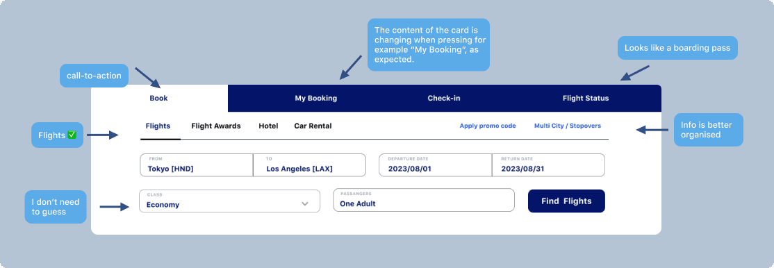
An organised and appealing Booking Card
Problem: copyright, inconsistancy
On booking card there are mistakes such as copyright, missing icons and inconsistency, buttons placed where are not supposed to be.
Solution: correcting mistakes
I redesigned the Booking Card, making it looks like a boarding pass and correcting the mistakes.
ANA Booking Card
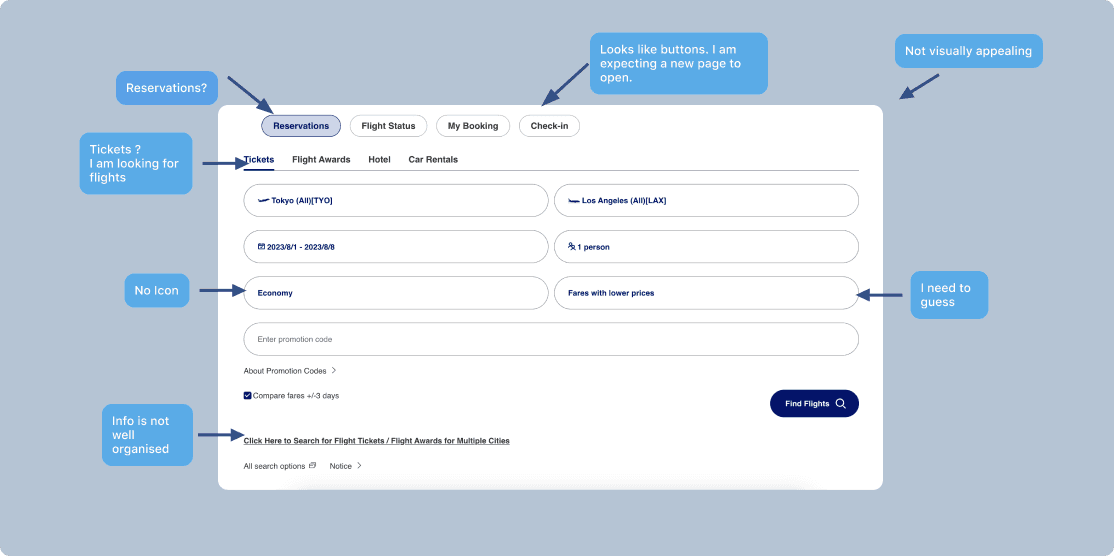
I need to guess
Info is not well organised
No Icon
Tickets ?
I am looking for flights
Reservations?
Looks like buttons. I am expecting a new page to open.
Not visually appealing
Challenge
Booking Flow has too many steps: 8 main steps. Some of the steps include another steps which require to open new web pages.
Information is not well organised: the same information can be found in many places.
It is not intuitive. The buttons, information, link text are not placed in the location where the user is expecting to find them.
It is not visual appealing.
New Booking Card

Info is better organised
I don’t need to guess
Flights ✅
call-to-action
Looks like a boarding pass
The content of the card is changing when pressing for example “My Booking”, as expected.
Deliver: Users were confused about the meal selection
I showed the prototype to 5 users.
I was particularly interested in the Booking Flow and how intuitive was. I also timed the users to see how much time it takes to go through the flow, from booking a flight until payment.
I wanted to compere with ANA’s booking flow timing to see if there is any improvement.
Usability Tests Insights
1
Booking Flow Completion 10 mins average time
Completing the New Booking Flow it takes 10 mins on average, which is a good improvement compering with completion of ANA’s Booking Flow which is 14 mins on average.
2
Users were concerned about meal selection
Two users asked why there was no information about the food received on board.
3
Step 4. Add-Ons was
suggested to be removed
Another user suggested to remove the ADD-ons because she was not interested in.
“I like the design. It is easy to navigate through the booking flow” - said one of the participants
Iteration Decisions
1
Introduced "meal selection" into design
I added information about the food in the Flight Details Card and in the Summary.
2
Kept the step Add-ons
I kept the Step Add-ons because I put my business hat on and I considered this step might bring extra profit for the airline.
Iteration Flight Detail
Iteration Summary
From this usability test I learned that I need to take into consideration also the business need, that’s the reason that I did’t not remove the step 4 “ADD-ONS”.
Elements
Redesign the UI, I took into consideration the colours that ANA’s website is currently having and also the companies’s values.
I chose to use cards throughout the design process to offer a better overview of the information and to make the website appealing.
I changed the shape of the button modifying the corners to 5 radius. I wanted to give a more professional look, but in the same time to be easy for the eyes. The ANA Design buttons with the round corner were friendly, but were not looking professional and classic.
Colour pallet
#111111
#041469
#C1D8F3
#ECC3D3
#F2F3F9
#FFFFFF
Cards

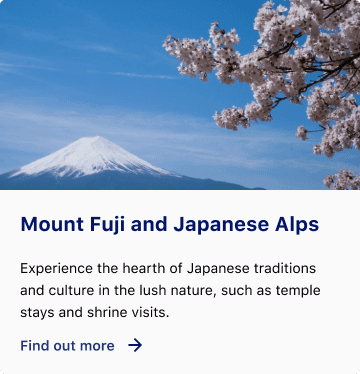
Mount Fuji and Japanese Alps
Experience the hearth of Japanese traditions and culture in the lush nature, such as temple stays and shrine visits.
Find out more
FInd Special Fare

Find Special Fare
Find out more

Buttons
Small Buttons 36h
Small Buttons
36h
Medium Buttons 48h
Medium Buttons
48h
Large Buttons 56h
Default
CLICK HERE
CLICK HERE
CLICK HERE
Version 2
CLICK HERE
CLICK HERE
CLICK HERE
Reflect: New Design vs ANA Design
New Design
6 Steps
Booking Flow
10 mins
Average time to complete ANA’s Booking FLow
ℹ
Information is pleasantly structured
✎
Consistency throughout the entire design.
ANA’s Design
8 Steps
ANA’s Booking Flow
14 mins
Average time to complete ANA’s Booking FLow
ℹ
Information is not well organised
✎
Design is not cosistent
What I would measure
• The conversion rate;
• The airline tickets sales through the website;
• Additional seals coming from seat selection and add-ons;
• The rate of users who are abandoning the Booking Flow and where.
Reflecting on the hole process, I consider the most important piece in redesigning ANA’s website was the Information Architecture. I decided to focus on the Information Architecture after doing Desk Research and Solution Space Research --> Observation .
The research validated my assumption that the ANA’s booking flow and website were cognitively overloading the users.
One stage that I found useful during the process was the paper wire-framing, where i was able to organise the information with sketches.
I would like in the future to have the chance to re-design the entire website, adapting it for tablets and mobile phones.
Final Design