DESIGNING FOR AI
DESIGNING FOR AI
How might we create a clear visibility of the process for the inspectors when AI is processing ?
How might we create a clear visibility of the process for the inspectors when AI is processing ?
Context
Context
This project is part of my collaboration with focalx, a start-up, located in Denmark, which creates AI powered vehicles inception for automotive.
This project is part of my collaboration with focalx, a start-up, located in Denmark, which creates AI powered vehicles inception for automotive.
Role
Role
As a UX/UI Designer, my approach was to emphasise with the inspectors to identify their pain points, devising effective solutions to address these issues, and than translating these solutions using visual cues.
The end-users of the mobile app are the inspectors. The choice to refer them as “inspectors” instead of generic “users” reflects a user-centred design approached tailored to address the specific needs of this professional demographic.
Wha I used
Wha I used
• How Might We, User Flow, Jobs to be Done;
• FIgma.
• How Might We, User Flow, Jobs to be Done;
• FIgma.
Inspectors’ Problem
Inspectors were getting confused regarding “In Progress” process.
Inspectors were getting confused regarding “In Progress” process.
In the “In Process” tab, inspectors were able to exclusively locate inspections that they had not yet completed.
They also got confused by the words “in progress”, as anticipated identifying inspections currently undergoing processing by AI.
In the “In Process” tab, inspectors were able to exclusively locate inspections that they had not yet completed.
They also got confused by the words “in progress”, as anticipated identifying inspections currently undergoing processing by AI.
Inspectors lacked visibility into the processing stage when AI was processing information.
Within the mobile app, a distinct visual indicator was absent during AI processing of inspections.
Inspectors faced difficulty discerning which specific inspections was undergoing processing at any given time.
Process
User Flow
Nishchinth, the VP Product and myself, had a meeting to discuss about user flow, focusing on the initiation and completion points of AI data processing.
Due to confidentiality reasons, below is presented a simplified diagram of of the User Flow and The AI Process.
Designing this diagram helped me understand what steps the inspectors had to complete and how the AI process was working.

Three areas
After having the diagram designed we reached a mutual agreement that there were three areas:
1
Inspector Task Pending
Inspections requiring completion by inspectors.
2
AI Processing
Inspections that were being processed by AI.
3
Completed
Inspections that were completed.
Jobs to be Done
In seeking a better understanding of inspectors’ requirements, I decided to use Jobs to Be Done. This approached facilitated informed decisions regarding necessary changes to the mobile app dashboard.
When i am on the dashboard page, I want to see my unfinished inspections so, I can complete them.
When i am on the dashboard page, I want to see the inspection Ai is processing so, I can be aware of the status of the inspection (if it’s completed or not).
When i am on the dashboard page, I want to see when the Ai has finished processing so, I can access the report.
When i am on the dashboard page, I want to see the completed inspection so, I can search for a specific inspection and access the report.
Solution
Information Architecture
During another meeting I was emphasising the notion that AI processing inspection is a temporarily step. However, it was important for inspectors to have visibility into which inspectons were currently being processed by AI.
This insight played a pivotal role in guiding Nishchinth and myself in shaping the information architecture.

From this step I learn that developers had to nest additional step in their process to make this design possible. Fortunately, the incorporation of such step was feasible and successfully implemented.
UI Design Changes
Using “Jobs to be Done” (see above Process - Jobs to be Done) I came up with several UI design ideas. Nishchinth decided to implement the version presented below.
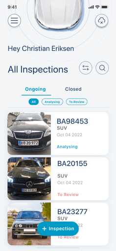
Dashboard Changes
1. Name of tab “In progress” was changed to “Ongoing”;
2. Name of tab "Completed" was changed to "Closed".
3. Tab “Ongoing” was added three sub-tabs: “All”, “Analysing” and “To Review":
• Analysing are the inspections being processed by AI;
• To Review are the inspection requiring completion by inspectors.
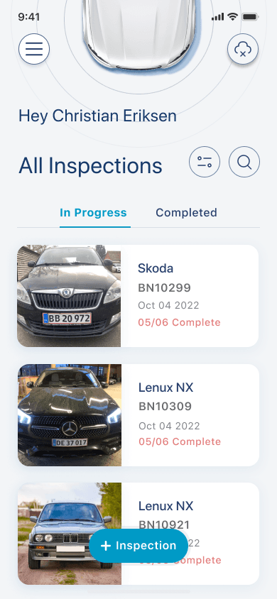
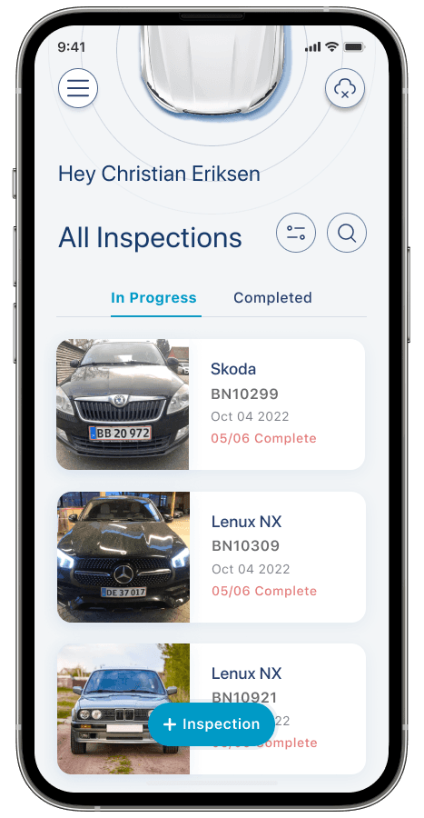
Old Version
New Version
Card Changes
The text and the status of the card:
• Analysing -> inspection being processed by AI;
• To Review -> inspections requiring completion by inspectors;
• Approved -> inspections which were completed.
Inspection Cards
Old Version

Skoda
05/06 Complete
BN10299
Oct 04 2022
New Version
BN10299
SUV
Oct 04 2022
To Review
BN10299
SUV
Oct 04 2022
Analyzing
BN10299
SUV
Oct 04 2022
Approved
Iteration: Inspectors were confused with the Ongoing tab
Test Insights
The new design was tested with inspectors. We got the following feedback:
• There were too many options “All”, “Analysing”, “To review”;
• This his sub-tabs “All”, “Analysing”, “To review” were somehow hidden.
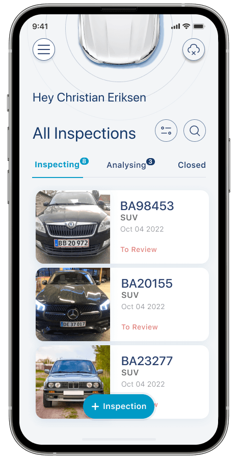
Design Decisions: Implement three tabs
After analysing the options that I came up before for this design and some discussion, we decided to implement:
• three tabs: Inspecting, Analysing and Closed;
• numerical indicators were incorporated as a visual clue, providing inspectors with real time information on the count of inspections being processed by AI and those remaining for their action.
Iteration 1
Iteration 2

Takeways
A good lesson I leat working on this project is that there is no right or wrong decision, the best design decision is the design that makes the user's work easier using visual clues.
The company is expending and I am sure that will be more design changes. I can't wait to be part of the growth of this start-up.
BEFORE
AFTER
BEFORE
AFTER
Inspectors’ Problem
Inspectors were getting confused regarding “In Progress” process.
In the “In Process” tab, inspectors were able to exclusively locate inspections that they had not yet completed.
They also got confused by the words “in progress”, as anticipated identifying inspections currently undergoing processing by AI.
Inspectors lacked visibility into the processing stage when AI was processing information.
Within the mobile app, a distinct visual indicator was absent during AI processing of inspections.
Inspectors faced difficulty discerning which specific inspections was undergoing processing at any given time.
Process
User Flow
Nishchinth, the VP Product and myself, had a meeting to discuss about user flow, focusing on the initiation and completion points of AI data processing.
Due to confidentiality reasons, below is presented a simplified diagram of of the User Flow and The AI Process.
Designing this diagram helped me understand what steps the inspectors had to complete and how the AI process was working.
Three areas
After having the diagram designed we reached a mutual agreement that there were three areas:
1
Inspector Task Pending
Inspections requiring completion by inspectors.
2
AI Processing
Inspections that were being processed by AI.
3
Completed
Inspections that were completed.
Jobs to be Done
In seeking a better understanding of inspectors’ requirements, I decided to use Jobs to Be Done. This approached facilitated informed decisions regarding necessary changes to the mobile app dashboard.
When i am on the dashboard page, I want to see my unfinished inspections so, I can complete them.
When i am on the dashboard page, I want to see the inspection Ai is processing so, I can be aware of the status of the inspection (if it’s completed or not).
When i am on the dashboard page, I want to see when the Ai has finished processing so, I can access the report.
When i am on the dashboard page, I want to see the completed inspection so, I can search for a specific inspection and access the report.
Solution
Information Architecture
During another meeting I was emphasising the notion that AI processing inspection is a temporarily step. However, it was important for inspectors to have visibility into which inspectons were currently being processed by AI.
This insight played a pivotal role in guiding Nishchinth and myself in shaping the information architecture.
From this step I learn that developers had to nest additional step in their process to make this design possible. Fortunately, the incorporation of such step was feasible and successfully implemented.
UI Design Changes
Using “Jobs to be Done” (see above Process - Jobs to be Done) I came up with several UI design ideas. Nishchinth decided to implement the version presented below.
Dashboard Changes
1. Name of tab “In progress” was changed to “Ongoing”;
2. Name of tab "Completed" was changed to "Closed".
3. Tab “Ongoing” was added three sub-tabs: “All”, “Analysing” and “To Review":
• Analysing are the inspections being processed by AI;
• To Review are the inspection requiring completion by inspectors.
Old Version
New Version
Card Changes
The text and the status of the card:
• Analysing -> inspection being processed by AI;
• To Review -> inspections requiring completion by inspectors;
• Approved -> inspections which were completed.
Inspection Cards
Old Version
Skoda
05/06 Complete
BN10299
Oct 04 2022
New Version
BN10299
SUV
Oct 04 2022
To Review
BN10299
SUV
Oct 04 2022
Analyzing
BN10299
SUV
Oct 04 2022
Approved
Iteration: Inspectors were confused with the Ongoing tab
Test Insights
The new design was tested with inspectors. We got the following feedback:
• There were too many options “All”, “Analysing”, “To review”;
• This his sub-tabs “All”, “Analysing”, “To review” were somehow hidden.
Design Decisions: Implement three tabs
After analysing the options that I came up before for this design and some discussion, we decided to implement:
• three tabs: Inspecting, Analysing and Closed;
• numerical indicators were incorporated as a visual clue, providing inspectors with real time information on the count of inspections being processed by AI and those remaining for their action.
Iteration 1
Iteration 2